Close


A flagship project that would raise Ms. Kollias’ profile was requested. Following an examination of the client’s desired brand image, a full explanation of the service, and the business objectives, Creatnity chose to embark on the project.
As the first step in the design process, the fundamental principles and traits of the brand were taken into consideration. Aligning Creatnity’s vision with the customer’s was our primary objective. The most important facets of the brand were highlighted on a mood map made with the client’s assistance.
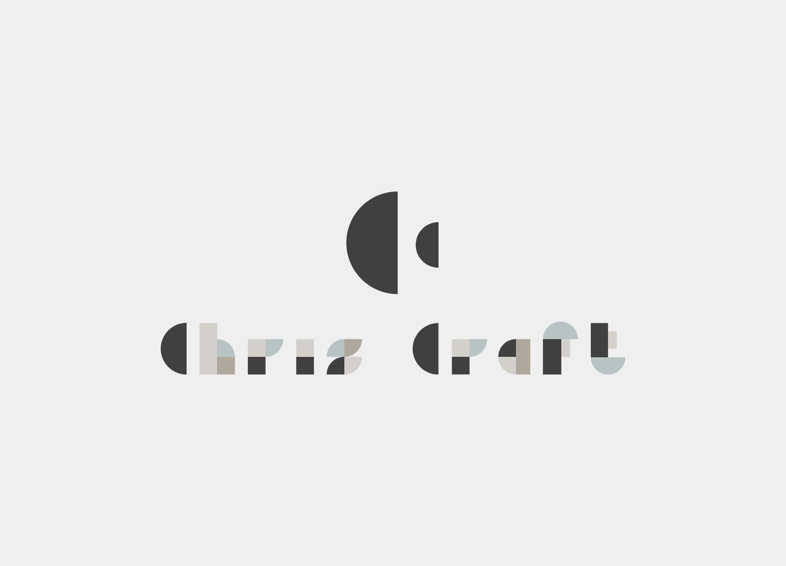
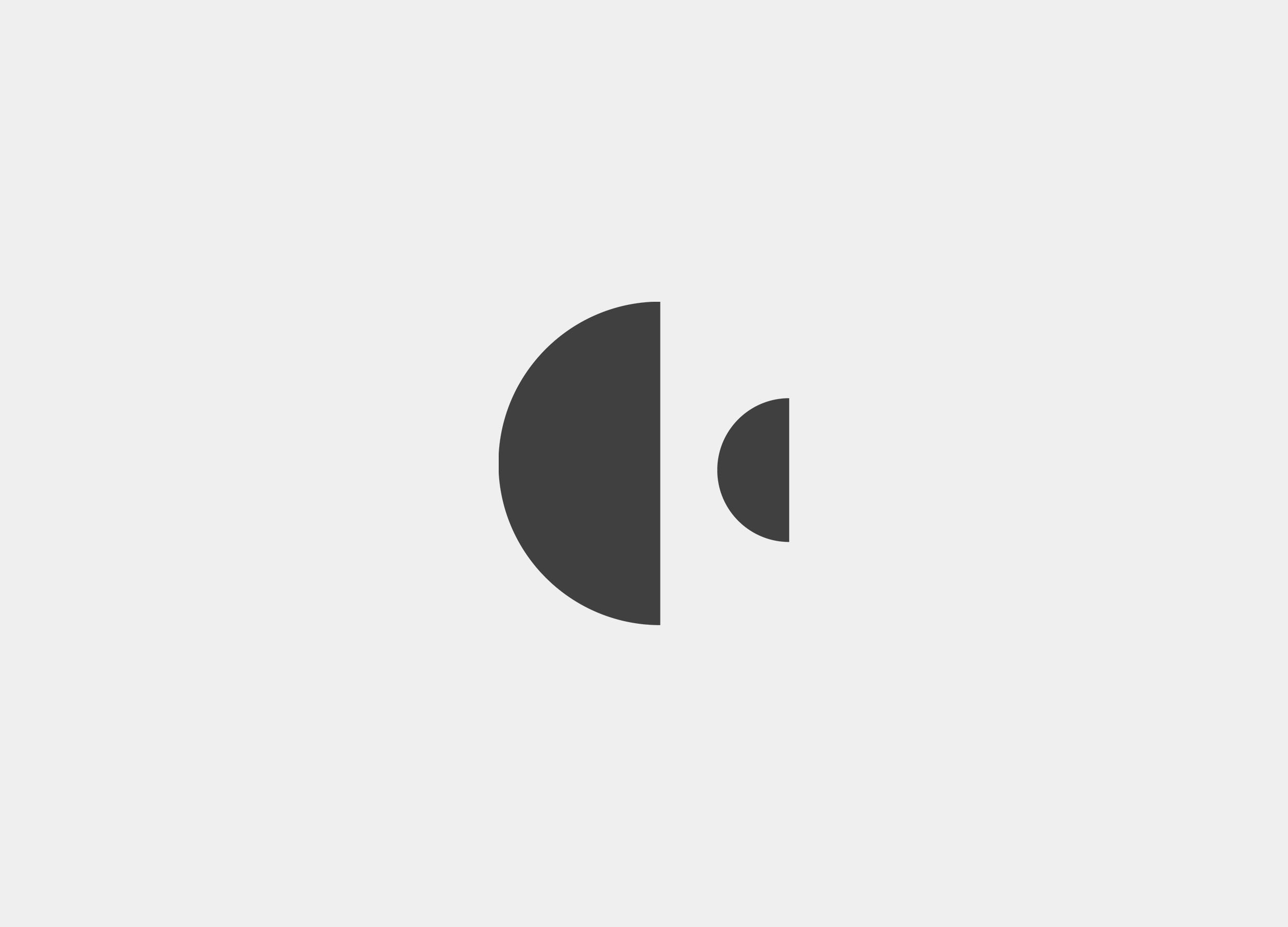
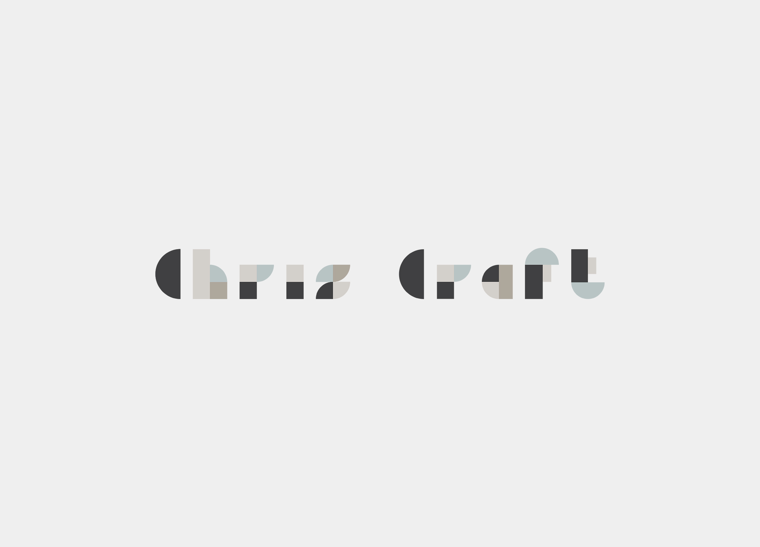
The logo’s colors are dark, aggressive, and earthy pastels, and the entire graphic style is flat and level. The initials “C” and “C” by Chris Craft are shown on the logo as one half of a circle and another half of a circle in opposition. To ensure that it was design-neutral, this was done with extreme care. The grammatical portion is impressive. Here, geometric forms like 1/2 circles, 1/4 circles, rectangles, and squares were combined to produce a typeface that was made by cutsom. The constant thickness of the lines, symbols, and letters creates a perfect overall impression.


