Close


The request was for a top-notch project that would increase Ms. Pispa’s visibility. Creatnity decided to take on the project after reviewing the business goals, a thorough explanation of the service, and the brand image the client want to create.
The brand’s essential values and characteristics were taken into account as the initial stage in the design process. Our original objective was to align our perspective with that of the client. A mood map was made with the client’s assistance, and the most crucial aspects of the brand were highlighted.
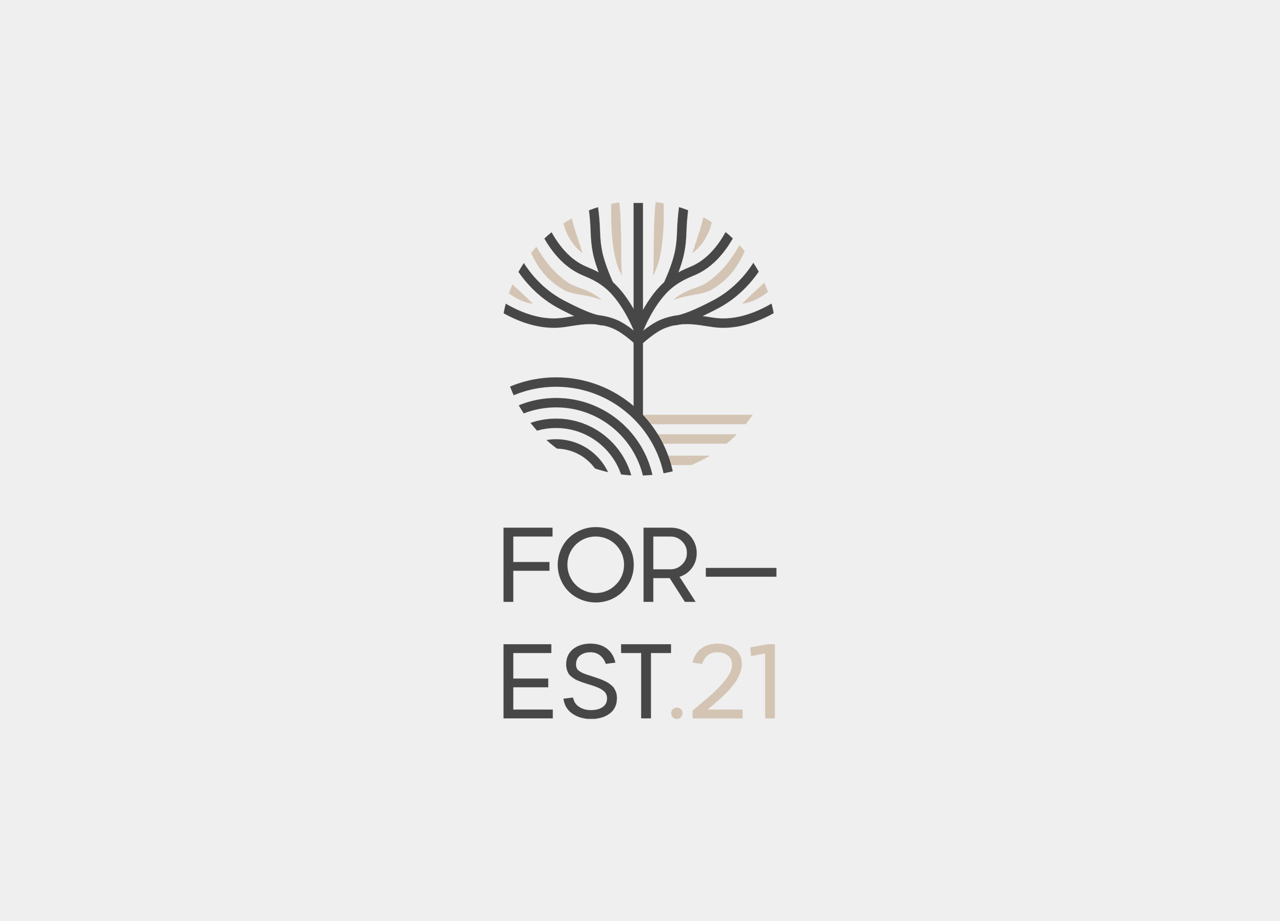
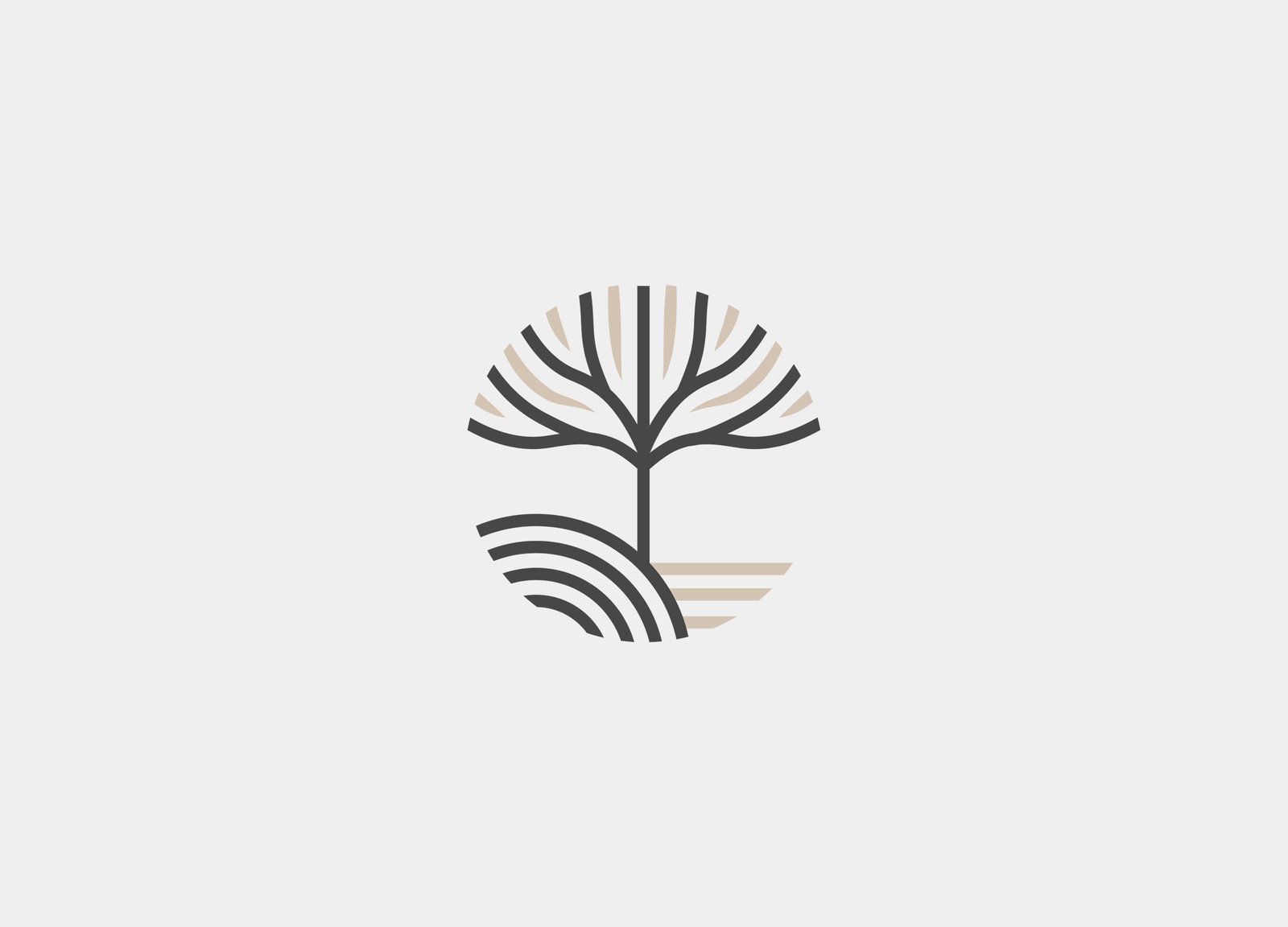
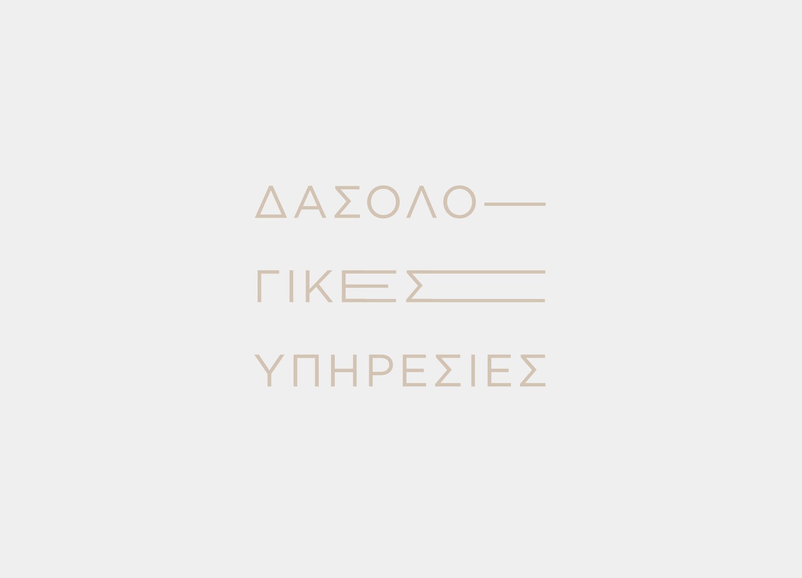
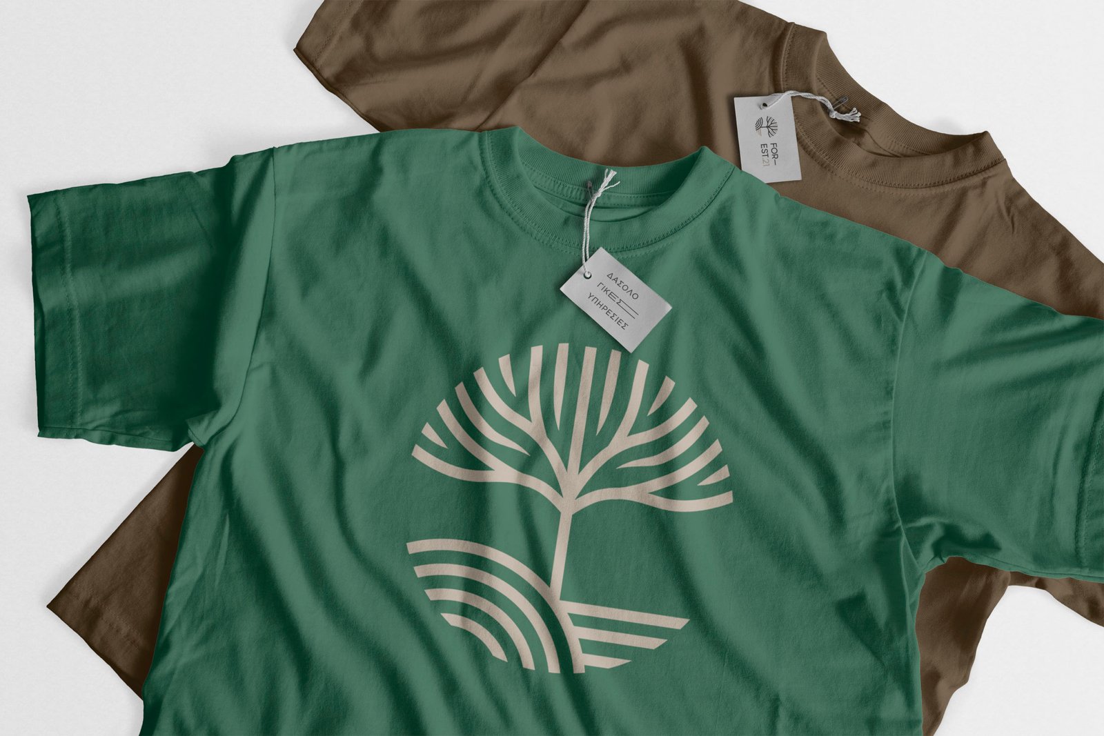
Light and dark earth tones are used to create the logo, and the overall graphic design is simple and flat. The emblem depicts the life of a healthy tree which is found in the union of different soil types. This was done with great care to ensure it was design neutral. A circle forms around the mark. The thickness of lines, symbols and letters are uniform throughout, resulting in an ideal overall image. Finally, literacy is added to the mark. Modern font, little post-processing, light, clean and easy to read.