Close


![pokp[]](https://creatnity.com/wp-content/uploads/2022/07/pokp-1-scaled.jpg)
Creatnity has been tasked with producing a project of the highest caliber that would increase the client’s brand’s visibility. Decided to take on the project after reviewing the client’s brand image, the company objectives, and a thorough explanation of the service.
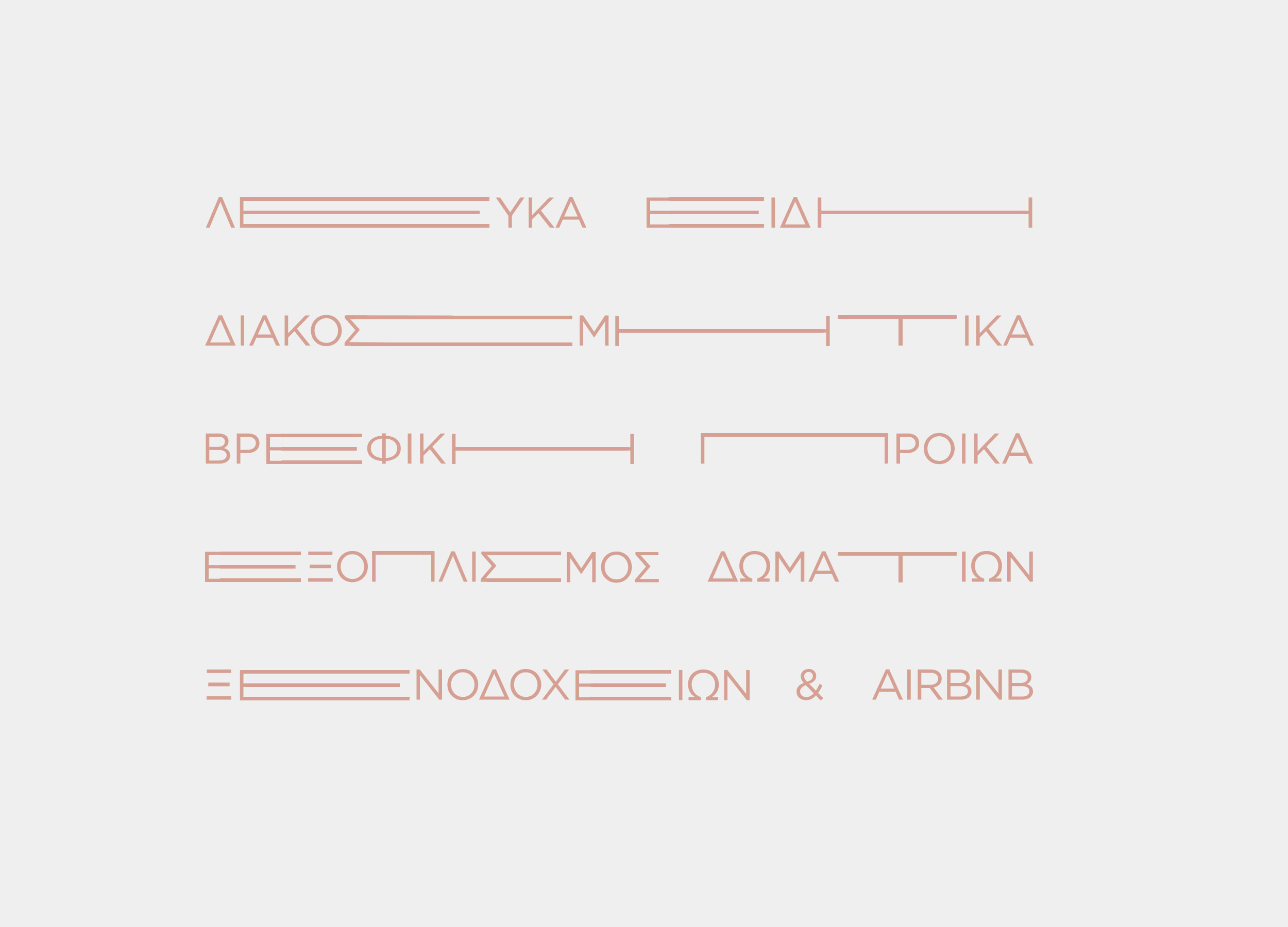
The brand’s essential values and characteristics were taken into account as the initial stage in the design process. The alignment of the customer’s perspective with Creatnity’s point of view was its original objective. Together with the client, a mood map was made, highlighting the key components of the customer’s brand.
The first step in the design process was to consider the brand’s core beliefs and attributes. Creatnity’s initial goal, the correlation of the point of view with that of the customer. With client’s, was created a mood map and highlighted the most important elements for the client’s brand.
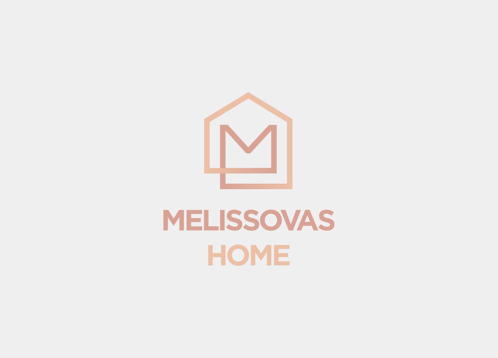
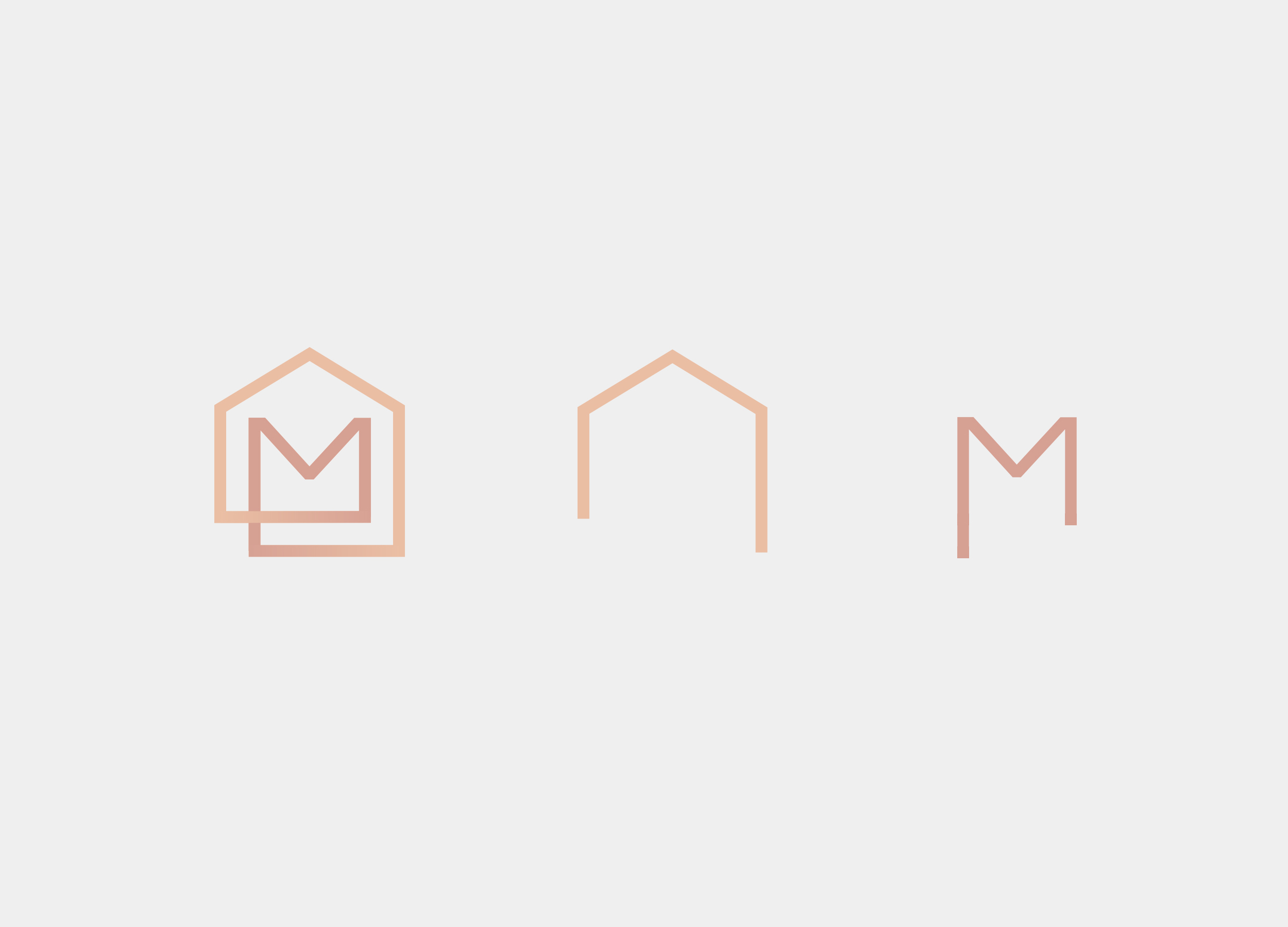
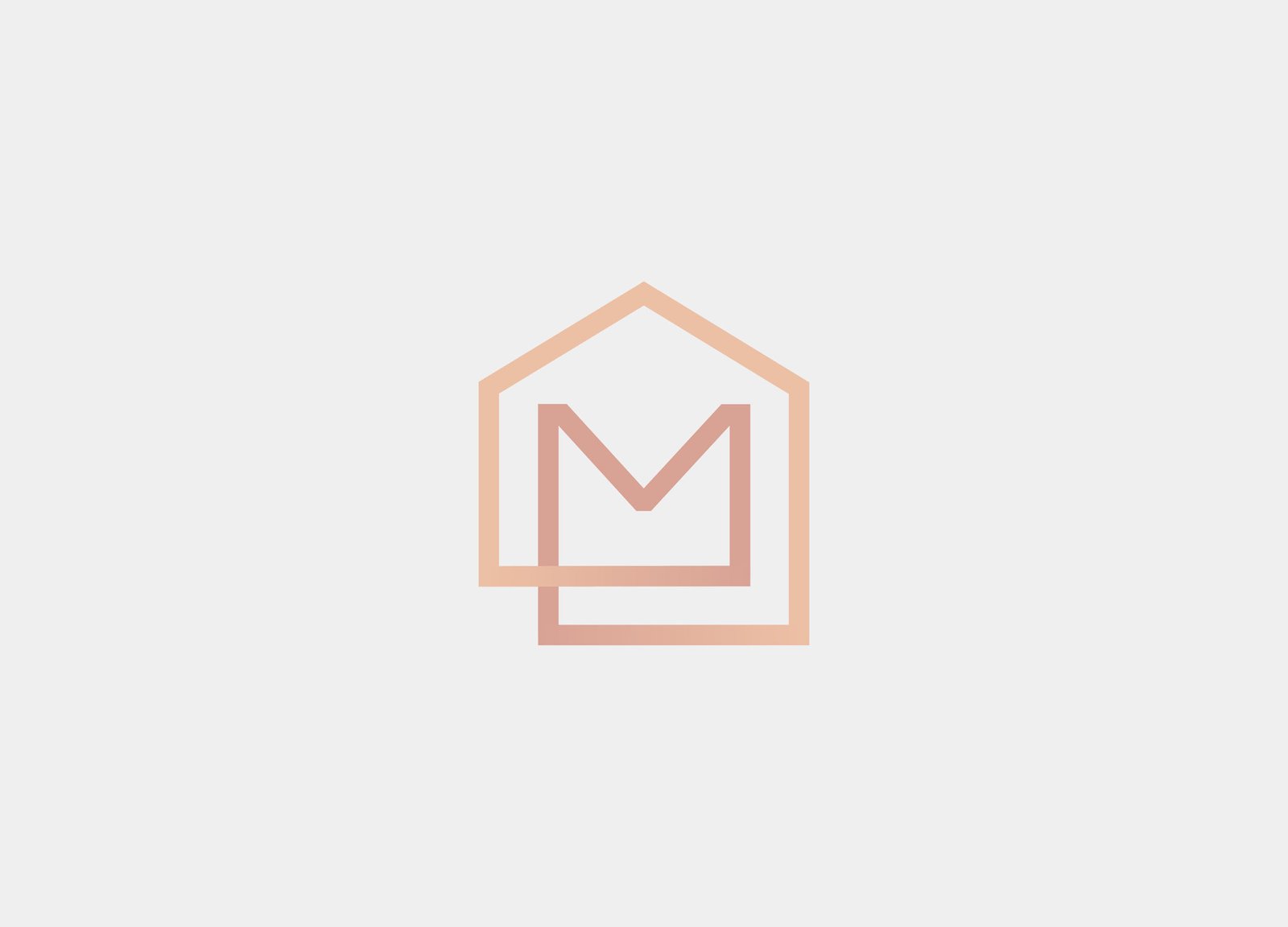
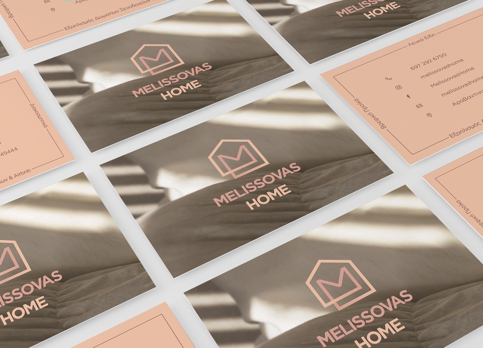
The logo is drawn on warm earths and the overall graphic style is basic and flat. The emblem depicts a figure of a house embraced by the initial letter “M”. This was done with great care to ensure it is design neutral. The two main elements are joined by connecting lines. The thickness of lines, symbols and letters are uniform throughout, resulting in an ideal overall image. Finally, the part of the letters is added to the mark. Modern font, little post-processing, light, clean and easy to read.
The design of the printed identity follows the same rationale as the logo. The beautiful and comprehensive design serves to better display the professional profiles of the client. The business card and prescription pad all contain the same design pattern.