Close

A high-quality project that would raise the profile of Mr. Karathanos’ brand was what he asked of us. According to the corporate objectives, a detailed description of the service and the brand image the client intended to portray, Creatnity agreed to tackle the project.
The first step in the design process was to consider the brand’s core beliefs and attributes. Our initial goal, the correlation of the point of view with that of the customer. With the help of our clients, we created a mood map and highlighted the most important elements for the client’s brand.
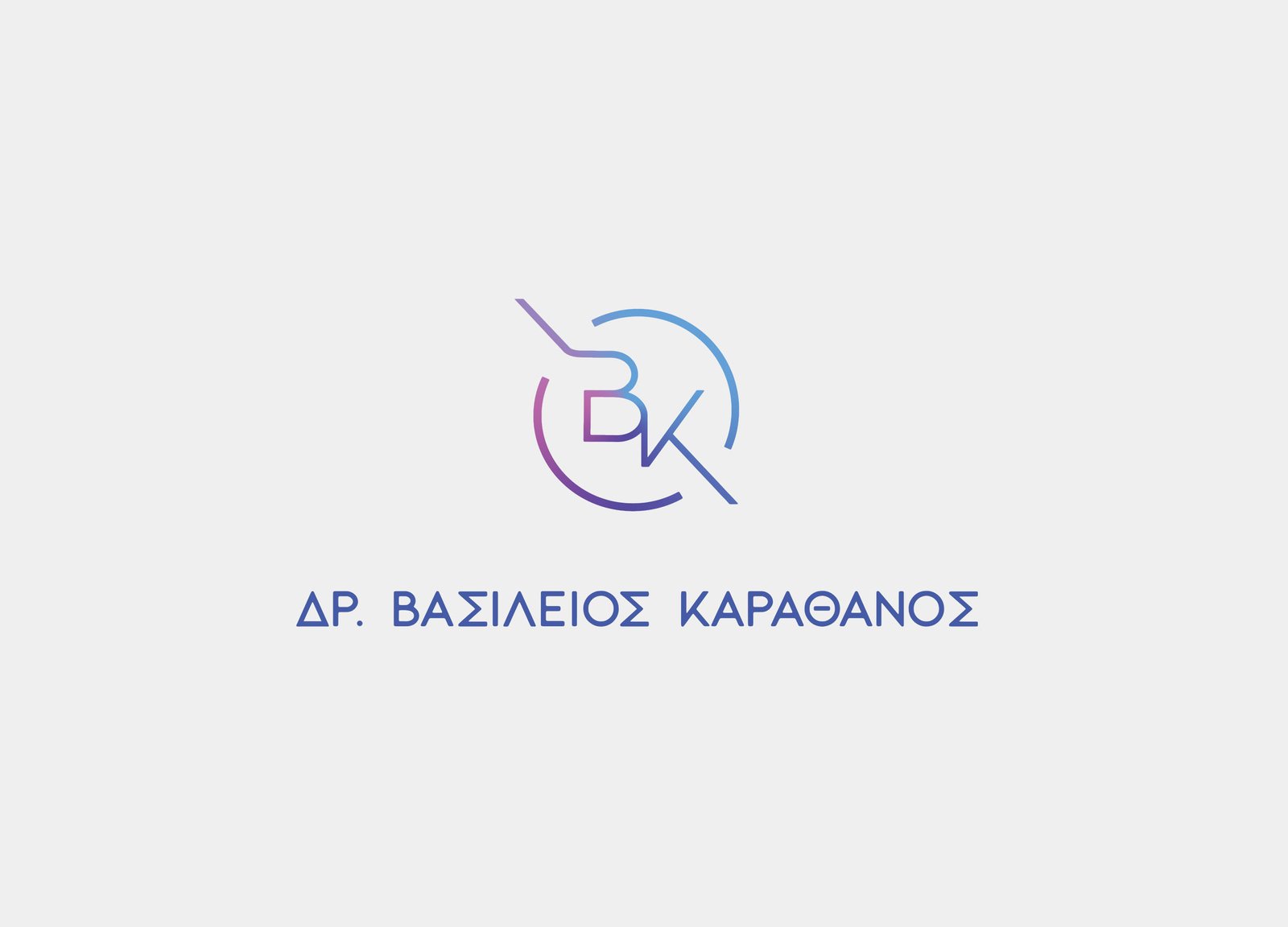
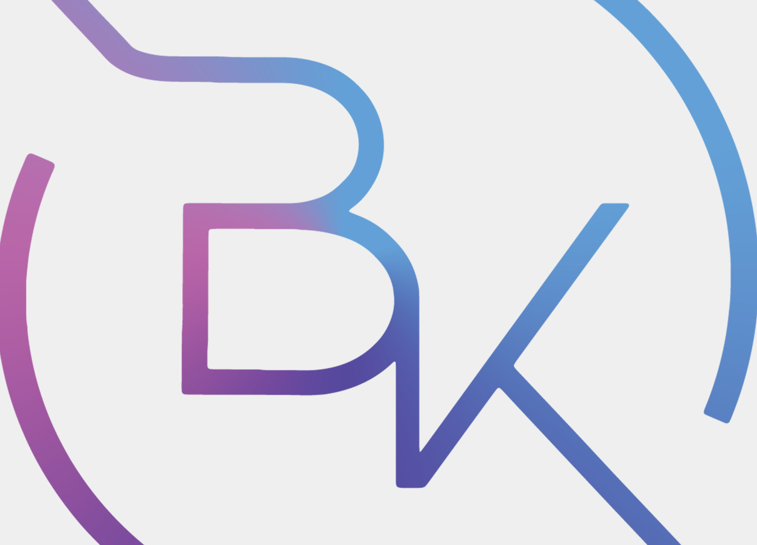
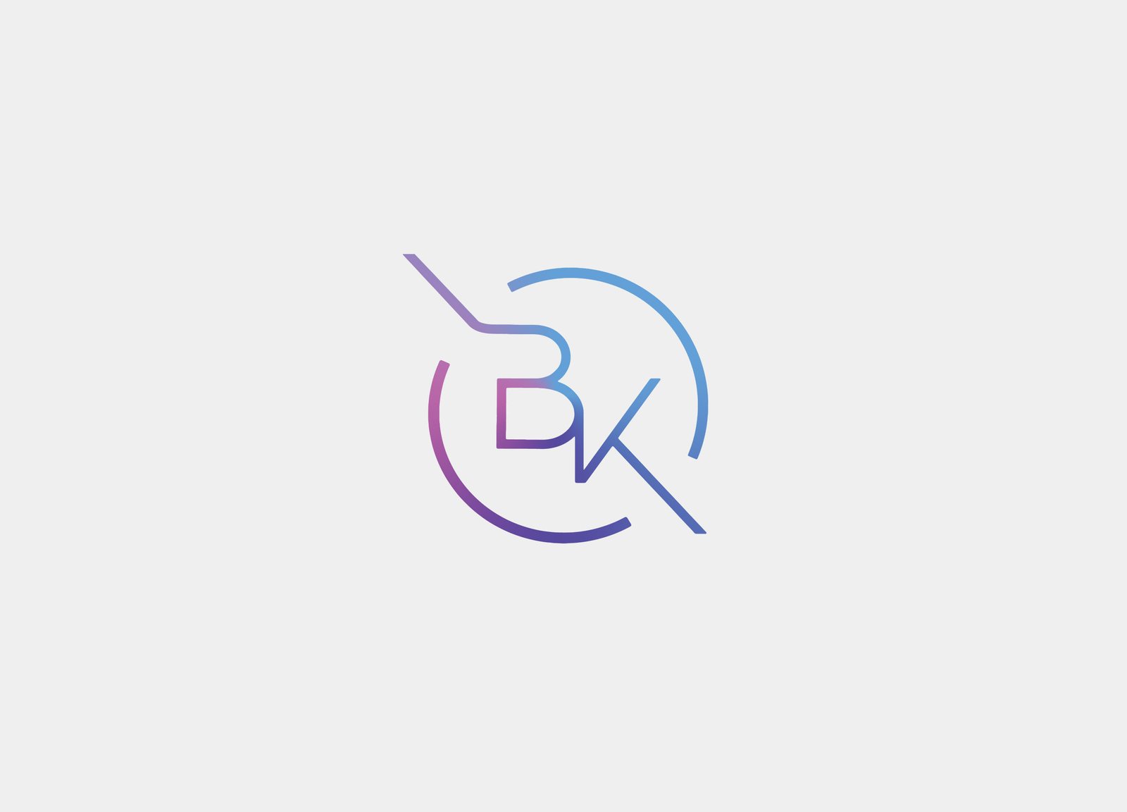
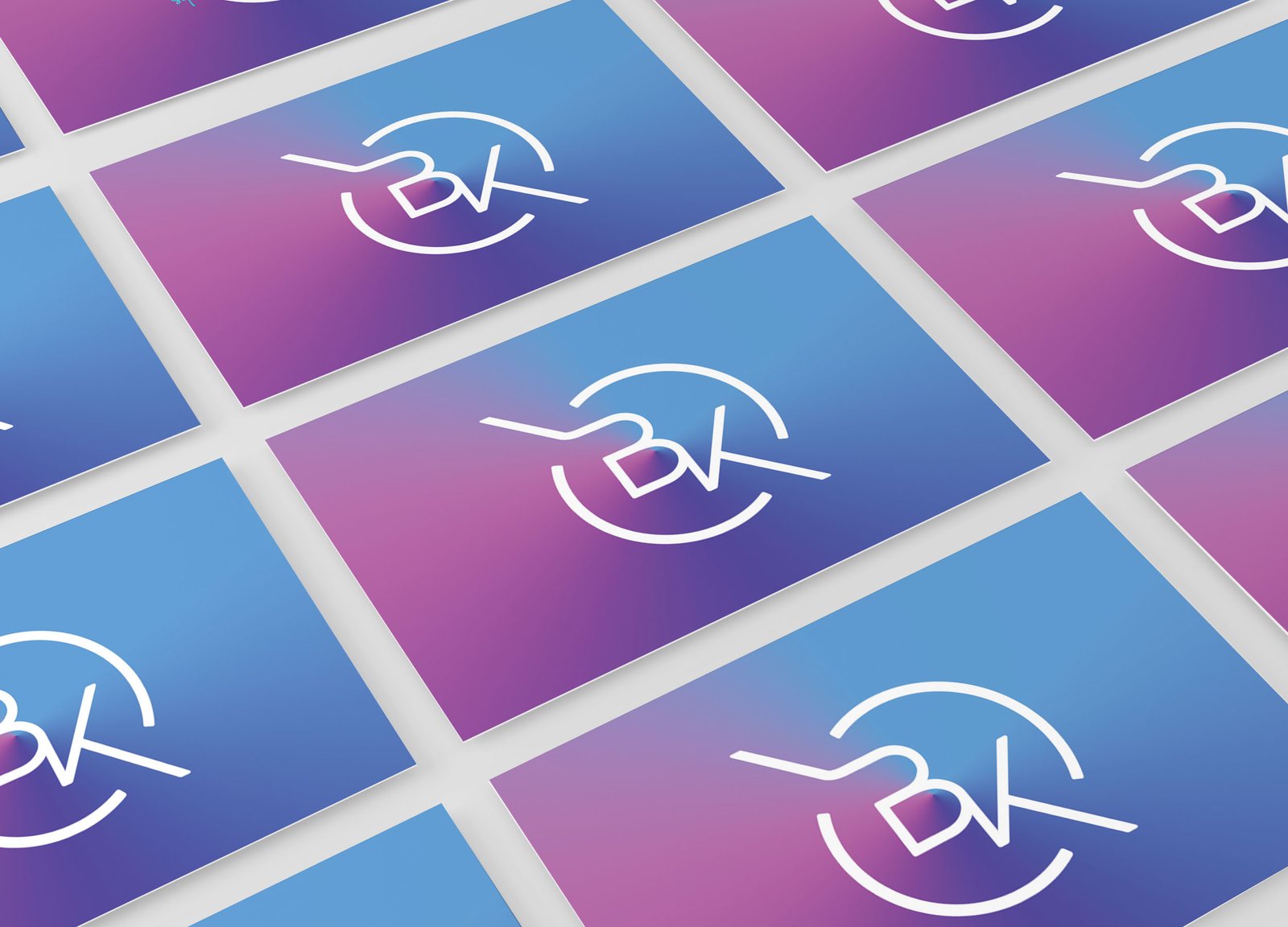
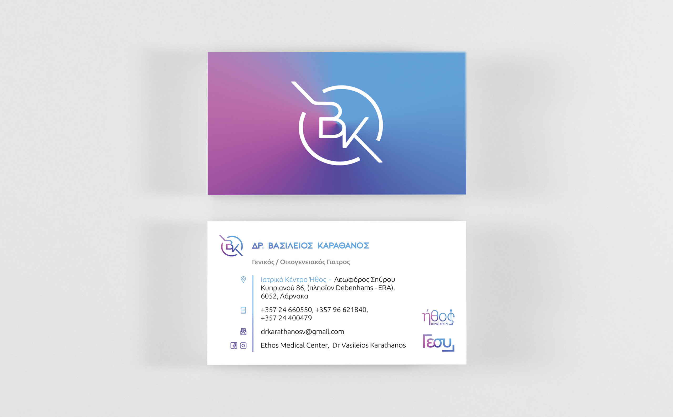
The logo slides in bright blue hues and the overall graphic style is basic and flat. The mark begins with a symmetrical pattern that looks like the image of your initials “B” and “K.” This was done with great care to ensure it was design neutral. A circle is formed around the mark. The thickness of lines, symbols and letters are uniform throughout, resulting in an ideal overall image. Finally, literacy is added to the mark. Modern font, little post-processing, light, clean and easy to read.
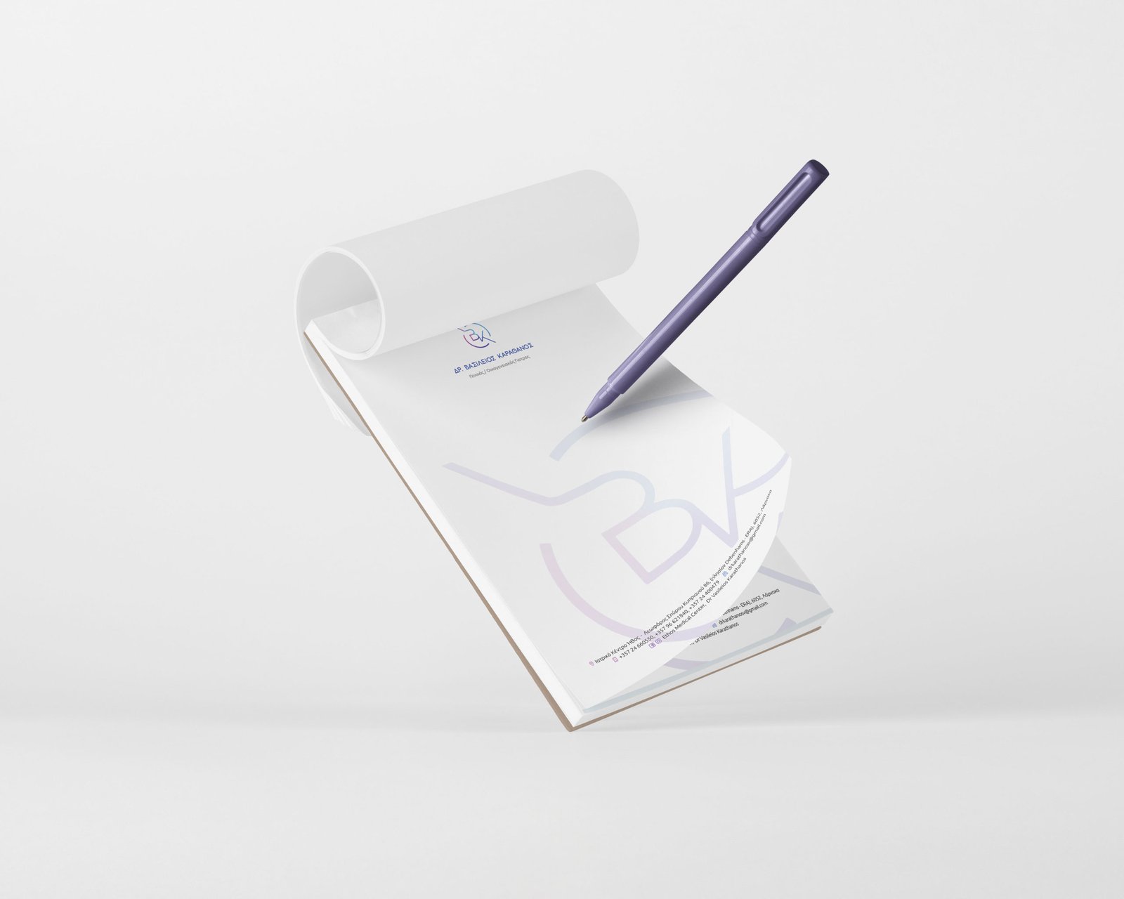
The design of the printed identity follows the same rationale as the logo. The beautiful and comprehensive design serves to better display the professional profiles of the client. The business card and prescription pad all contain the same design pattern.


